#gradient palette
Explore tagged Tumblr posts
Visit Tumblr Blog
Explore Tumblr blogs with no restrictions, modern design and the best experience.
Last Seen Tumblr Blogs


Fun Fact
Average visit duration of Tumblr.com is 10 mins and 25 secs.
Text

Snowy Diamond Flakes

Hex code: #F6F6F7

Hex code: #D9D8DF

Hex code: #B0C2D7

Hex code: #B2A7BB

Hex code: #E4C2C7

Hex code: #F7D7D4


GIF source
Like/rb if use || no need to credit me || Click here for more!
#blue dividers#line divider#mini banners#line dividers#omi.resources#dividers#blue aesthetic#color palettes#carrd resources#blog resources#resources#banners#mini banner#graphics#color palette#gradient banners#gradient dividers#snow aesthetic#winter aesthetic#pastel colors#purple#pink#grey#gif#blue
4K notes
·
View notes
Text
#colorschroma#color palette#color scheme#gradient color generator#gradient color palette#gradient palette#design#random color generator#contrast checker#css gradient#colorpicker#2color gradient#3color gradient#brand color palette#palette#color swatches
1 note
·
View note
Text
im no less than what i cant be
#original art#just realized im unintentionally making that one infamous unpleasant gradient my almost consistent palette#shes like a cousin to me. twice removed.#and shes beautiful#TAGS THANK YOU BUT THIS ^ WAS NOT MEANT TO BE SELF DEPRECATING !
6K notes
·
View notes
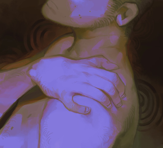
Note

I kidnapped ur long-nosed cat for a sec
.
#last year you said that “dude looks like he's been betrayed in all past lives and is to be betrayed in all lives to come”#and it has become one of the defining descriptions of Machete in my head#I think about it frequently#you captured him so delicately here#almost like an old oil painting#or weirdly enough the color palette also reminds me of chalk on a blackboard#and I appreciate the big angular pink-tinted goblin ears#and the smooth gradient of his snout#I like the nuance of his expression he seems calm but kind of melancholic#thank you! your rendition of him looks so classy and refined ;-;#gift art#awkwardosthe3rd#Machete#own characters#I can't paint digitally at all so whenever I see someone making it seem so natural and correct and right I'm like#floored#people are making such nice art of my goobers I have no choice but to curl on the floor like a dead bug
2K notes
·
View notes
Text
Deviants (art club)
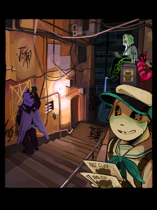
Nightwatch posting the art club kids
#utmv#sans au#undertale au#nightwatch au#paperjamsans#palette sans#gradient sans#goth sans#nightwatch palette#nightwatch Gradient#nightwatch PJ#nightwatch punk#punk sans is his name#goth who?#Error sans#dream sans#memory sans#scell sans#fell sans#ran out of tag ideas
708 notes
·
View notes
Text
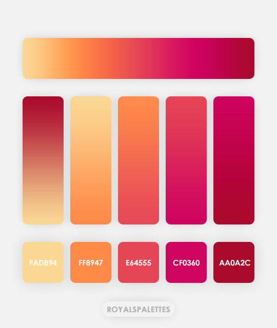
fad894 - ff8947 - e64555 - cf0360 - aa0a2c
#hisources#allresources#completeresources#itsphotoshop#yeahps#color palette#gradient#five#gradient template#orange#red#yellow
288 notes
·
View notes
Text
I think 90% of my gripes with how modern anime looks comes down to flat color design/palettes.
Non-cohesive, washed-out color palettes can destroy lineart quality. I see this all the time when comparing an anime's lineart/layout to its colored/post-processed final product and it's heartbreaking. Compare this pre-color vs. final frame from Dungeon Meshi's OP.


So much sharpness and detail and weight gets washed out and flattened by 'meh' color design. I LOVE the flow and thickness and shadows in the fabrics on the left. The white against pastel really brings it out. Check out all the detail in their hair, the highlights in Rin's, the different hues to denote hair color, the blue tint in the clothes' shadows, and how all of that just gets... lost. It works, but it's not particularly good and does a disservice to the line-artist.
I'm using Dungeon Meshi as an example not because it's bad, I'm just especially disappointed because this is Studio Trigger we're talking about. The character animation is fantastic, but the color design is usually much more exciting. We're not seeing Trigger at their full potential, so I'm focusing on them.
Here's a very quick and messy color correct. Not meant to be taken seriously, just to provide comparison to see why colors can feel "washed out." Top is edit, bottom is original.
You can really see how desaturated and "white fluorescent lighting" the original color palettes are.
[Remember: the easiest way to make your colors more lively is to choose a warm or cool tint. From there, you can play around with bringing out complementary colors for a cohesive palette (I warmed Marcille's skintone and hair but made sure to bring out her deep blue clothes). Avoid using too many blend mode layers; hand-picking colors will really help you build your innate color sense and find a color style. Try using saturated colors in unexpected places! If you're coloring a night scene, try using deep blues or greens or magentas. You see these deep colors used all the time in older anime because they couldn't rely on a lightness scale to make colors darker, they had to use darker paints with specific hues. Don't overthink it, simpler is better!]
#not art#dungeon meshi#rant#i'm someone who can get obsessive over colors in my own art#will stare at the screen adjusting hues/saturation for hours#luckily i've gotten faster at color picking#but yeah modern anime's color design is saddening to me. the general trend leans towards white/grey desaturated palettes#simply because they're easier to pick digitally#this is not the colorists fault mind you. the anime industry's problems are also labor problems. artists are severely underpaid#and overworked. colorists literally aren't paid enough to do their best#there isn't a “creative drought” in the anime industry. this trend is widespread across studios purely BECAUSE it's not up to individuals#until work conditions improve anime will unfortunately continue to miss its fullest potential visually#don't even GET ME STARTED ON THE USE OF POST-PROCESSING FILTERS AND LIGHTING IN ANIME THOUGH#SOMEONE HOLD ME BACK. I HATE LENS FLARES I HATE GRADIENT SHADING I HATE CHROMATIC ABBERATION AND BLUR
2K notes
·
View notes
Text
She's literally so cool
#nekuyan#crossplay love#crossplay love: otaku x punk#kiyoart#i wanna reread the whole manga and doodle shimazaki as well but i have to get some work done for tomorrow#the world is getting in my way it should stop#oh if it wasn't clear shuumei's genderfluid to me i took the flag and used it as a color palette#i put a gradient over it so the pink lost it's; well; pink but ya know
171 notes
·
View notes
Text

this was fun to do ngl, i finally was able to draw a sans more naturally (the program was the problem i think)
WHATEVS my sexy motherfucker❤️🩹/lh if you don't win at the morn you will win in my heart
ink sans by @/comyet
#every outfit was found on pinterest btw#undertale#undertale au#utmv#ink sans#errorink#paper jam sans#gradient sans#drink ship#palette sans#palette roller#fluffy doodles#fluffy ink
536 notes
·
View notes
Text
and if I make a miniscule adjustment to her color palette is it even noticeable
plus a bonus thing with her parents

ignoring the fact that they're not physically together at the moment
(★ my Kofi)
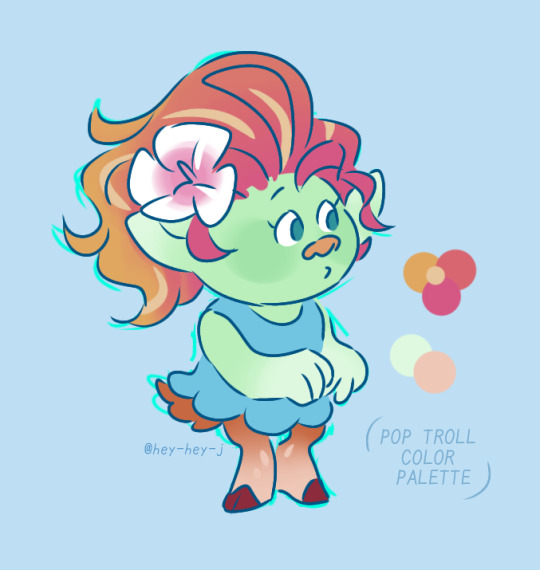
#my art#dreamworks trolls#trolls fanart#trolls au#trolls oc#trolls floyd#trolls hickory#pastel green + pink-to-orange gradient give away her half pop heritage#(yodelers have more grounded earth tone color palettes compared to pop's hyper-saturation)#anyway I like that her nose and eye colors are uniquely HERS.#like yeah the eye color is hereditary (floyd's side) but it's not present on either of her parents so it stands out#does any of this interest anybody#trolls#the dream au
316 notes
·
View notes
Text
BROWN LINE DIVIDERS ⋮┆
𝜗𝜚 ࣪˖ ִ𐙚 ⩇⩇:⩇⩇ : : creds not needed but appreciated use ↴ “#bbyg4rl helps” or tag me !


: : hex codes used : : #B4978E | #fff | #4A2F24 !
𝜗𝜚 ࣪˖ ִ𐙚 𝟏𝟏:𝟏𝟏 : : check out my other works ! index
© bbyg4rlhelps . est . 2025
#bbyg4rl helps#brown dividers#dividers#dividers by bbyg4rlhelps ꒰ა ෆ ໒꒱#line divider#mini banners#brown aesthetic#colour palette#gradient#gradient dividers#gradient banners#brown#white#aesthetic#aesthetic dividers#blog help#blog resources#fic dividers#girl blogger#girlblogging#theme help#writing resources#blog dividers#blog decor#blog design#divider#tumblr dividers#fic divider
158 notes
·
View notes
Text
the secret to having everybody compliment your colors in your comics is to make every scene one color. this is the Green Scene and this is the Red Scene and now you are a genius
#i should make a real post about how to use gradient maps to unify a palette#i have before but i could do it better
203 notes
·
View notes
Text
Calypso knows how to throw a party
#ofmd#ofmd s2#John feeney#izzy hands#just the thought of tagging the rest of the crew makes me tired sorry-#anyway take this mess of values and colors i dont want to work on it anymore#maybe i will try somethign related to this ep again in a while#should restrict my color palette then#i threw so many gradients and overlay layers over this you have no idea lol
2K notes
·
View notes
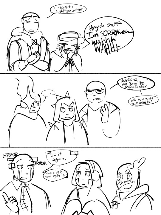
Text

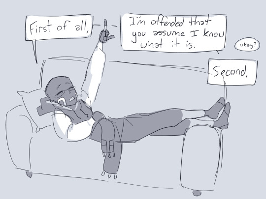

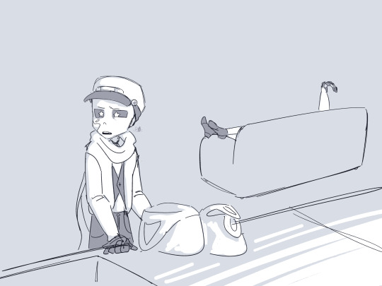
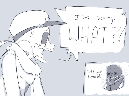
Mini comic time babyyy
This has been on my mind ever since I found out PJ just reverts to ink puddle form when extremely tired
Transcript;
Palette: Hey, Gradient?
Gradient: Yeah?
Palette: Why is there a giant black puddle in my kitchen?
Gradient: First of all, I’m offended that you assume I know what it is.
Palette: Okay?
Gradient: Second, that’s just PJ. Leave her alone if you value your life.
Palette: (I liked this mat…)
~ Long Silence ~
Palette: I’m sorry, WHAT?!
Gradient: (It’s your funeral!)
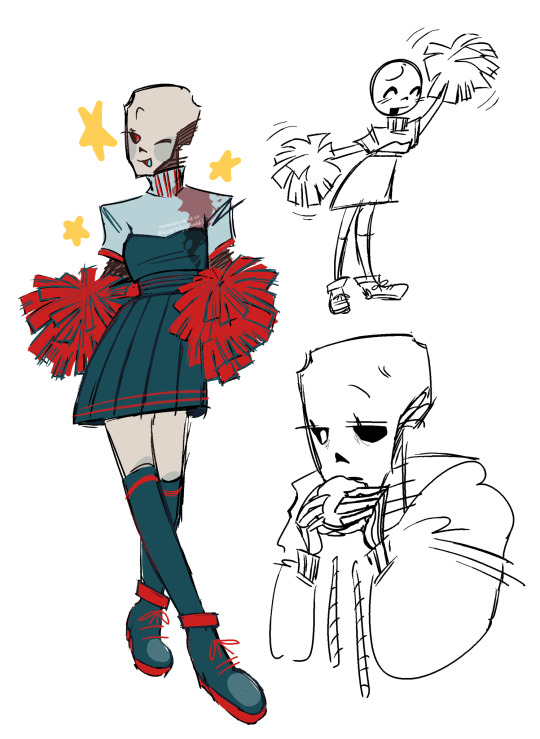
I would’ve drawn PuddleJam but I’ve got a plane ride in a few hours and I haven’t slept lol
Palette by angeutblogo
Gradient by ask-combo-club
offscreen PaperJam by 7goodangel
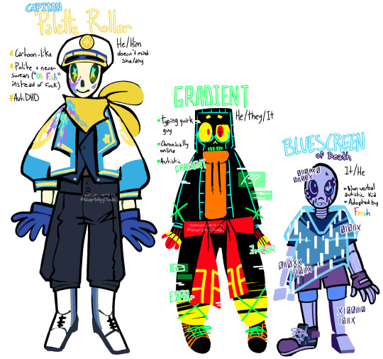
#utmv#utmv au#digital art#fanart#palette roller#gradient#paperjam#mini comic#silly little guys#i hate them#/pos ofc
648 notes
·
View notes
Text


Evil shipkid stuff
I just wanted to experiment with my style and establish how I draw some shipkids(and draw Lux again,, thx @meglyfer, that Luxes post inspired me to draw more Lux)
Credits/tags + extra under the cut(as always lol)
This drawing but without filter because I can’t tell if I like this or not sigh

Characters;;
Raven by @echoiarts
Lux by AlainaPrana
PaperJam and Bluescreen by @7goodangel (+ askinfresh for Screen)
Palette by @lasseutblogo
Gradient by @askcomboclub
Moot tags;;
@clownray1 @yeloenk @lushciqqs @doodlesphxre @frumpy-blu3y (I think you’d appreciate Bluescreen)
#꒰ bp’s art ꒱#raven mention 🔥🔥#lux mention 🔥🔥#utmv#raven sans#raven afterdeath#afterdeath#gradient sans#paperjam#paper jam#errorink#palette roller#dream x ink#lux sans#cream ship#bluescreen sans#errorberry
228 notes
·
View notes
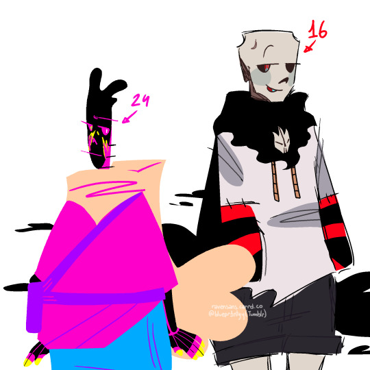
Text
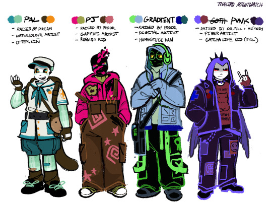
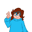
Art club
Nightwatch ref sheet posting once again. Here’s the reference for art club (evil little children). While they definitely aren’t main characters they are important to the story as they reflect the adults around them. You have palette, son of the highly respected gaurdian Dream. Pj and Gradient children of the “temporarily” retired threat to the multiverse, Error. And Punk, adopted child of two loser doctors. These 12 yr old nerds have art skills in common and they come together to form the art club (sponsored by gaurdian of creators, Ink)
Don’t worry these are like some of the only characters who won’t be massively traumatized.
I’m excited for you guys to read them interacting because they have been fun to write so far. They are a good tool for lore building, I use them to explain how ship children exist (it’s not sex dw, no mpreg here folks sorry) and the lack of free will between creators and creations (Poor ink)
Anyways enjoy the designs, toodles
739 notes
·
View notes